
In this section this is where i will begin to outline what i feel should be in my magazine and show what images and text i feel could be used in my final piece. This section includes my drawn drafts, digital drafts, my original pictures that i have taken and reflecting upon more magazine covers in the magazine aesthetics section.
Magazine Aesthetics
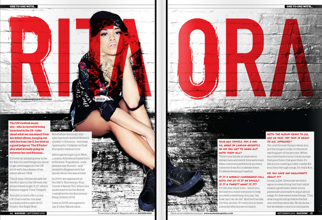
Five Front Covers:
|
|
|
|
|
|
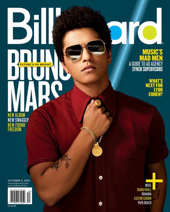
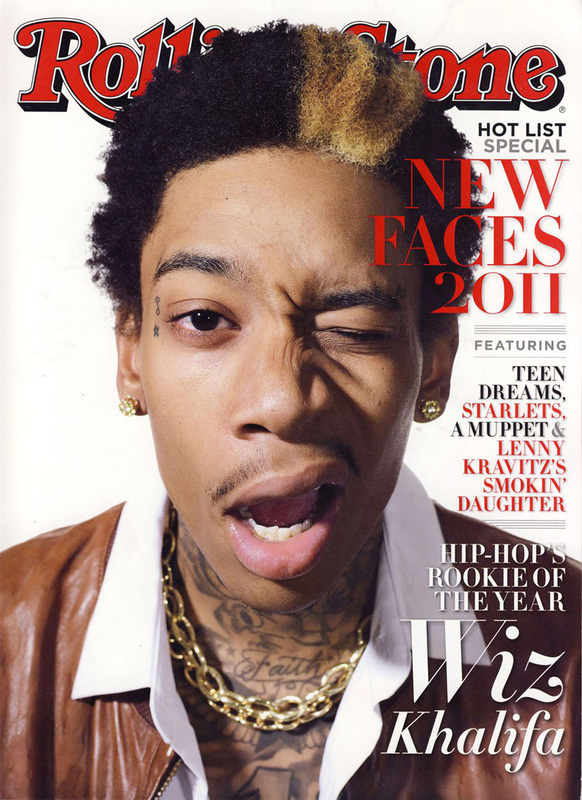
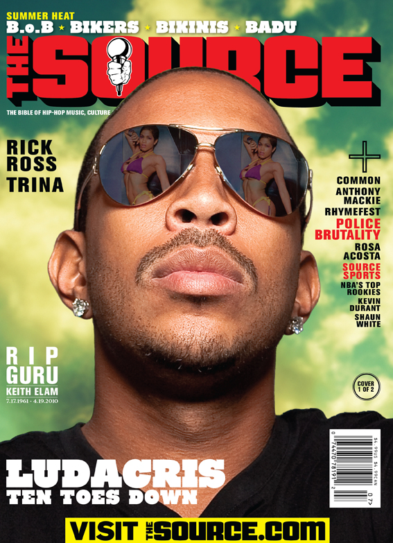
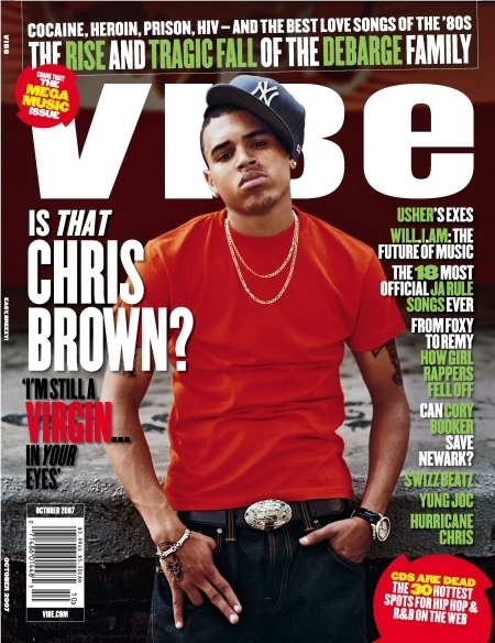
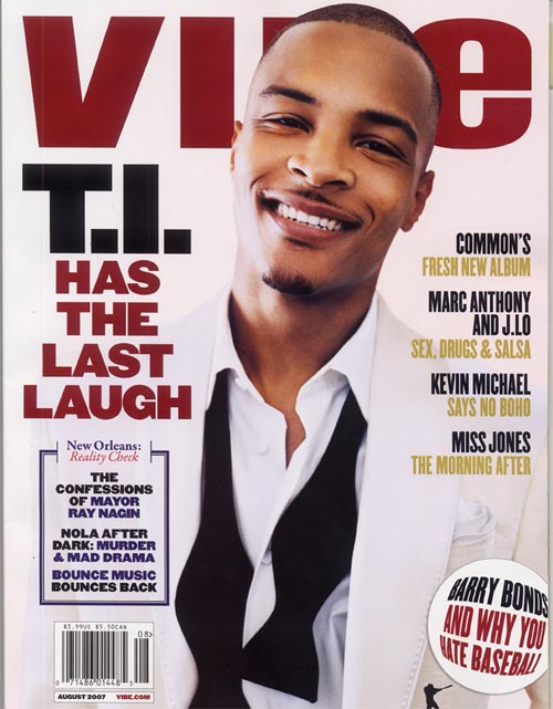
I like the main images NVC. It makes him stand out. I also like how is in the centre of the magazine.
|
I like the colour scheme for this magazine (Red and a white background) this makes the main image stand out.
|
I like the sunglasses prop, so that we are able to see what the main image is seeing.
|
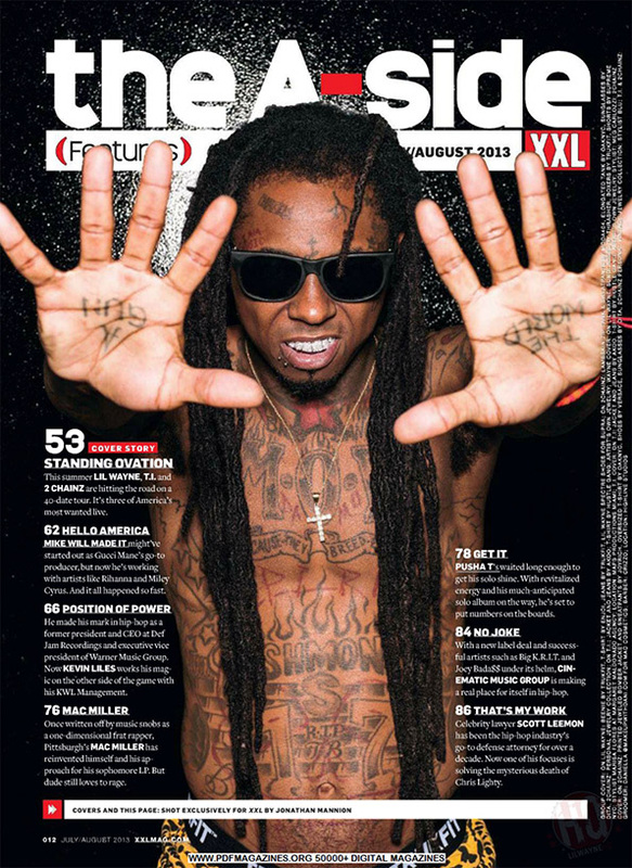
I like the layout of this magazine with the main image in the centre and the cover around him.
|
I like the background colour used (white) because this makes the main image stand out also because he is in front of the masthead.
|
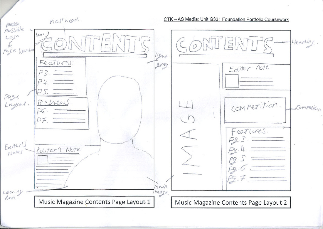
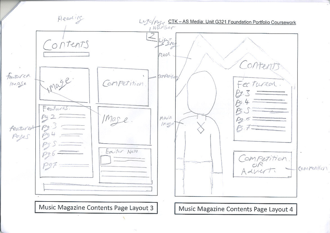
Five Content Pages:

|
|

|
|
|
|
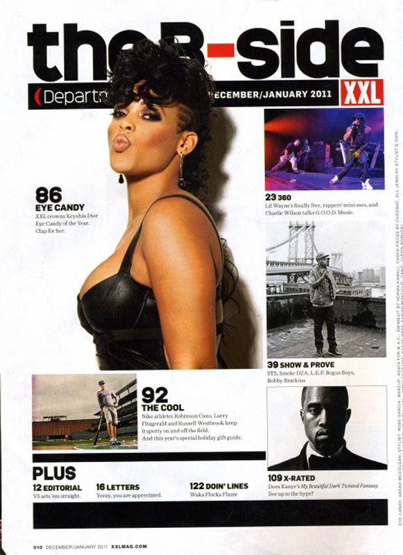
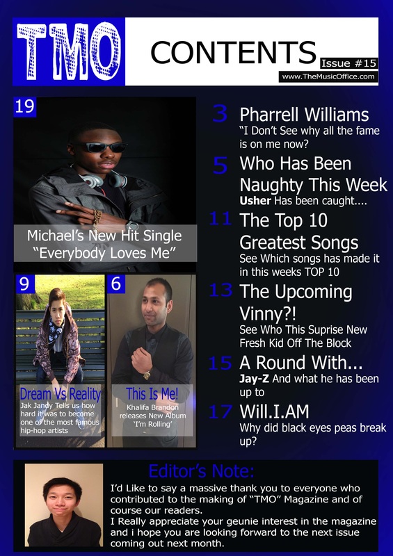
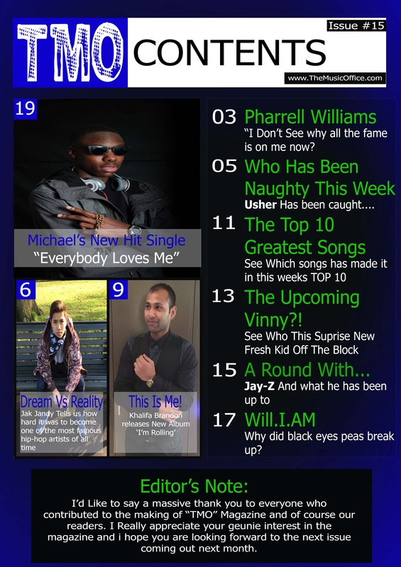
I like the colors used in this contents page because it makes the features image stand out with the bright colour costume she is wearing.
|
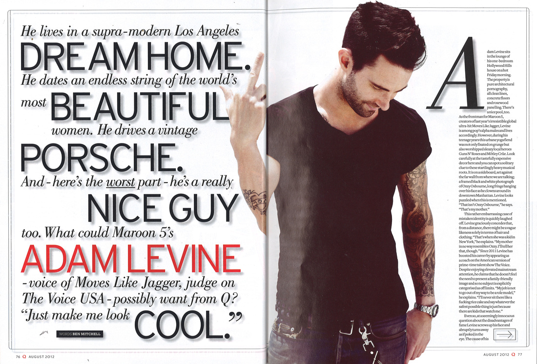
I like the main image in this magazine, the pose of the main image makes him stand out, this image makes you feel like his hands are almost touching you.
|
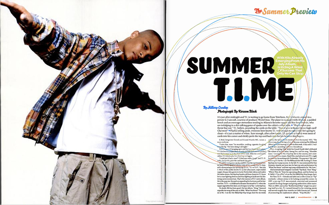
I really like the layout of this contents page because the "Contents" title is not all on the same line which is quite unique. Also the main image NVC is very strange and it question you why he is doing that.
|
I like the pose of the main image of this contents page because it looks like she is next to the text. also the layout of this contents page is well structured.
|
I like the main image in this content page this is because she is in front of the masthead. making her stand out. I also like the main images NVC.
|
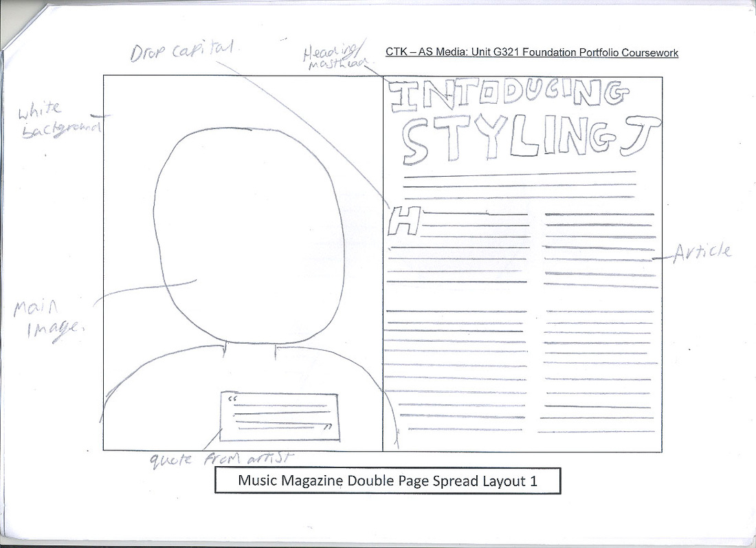
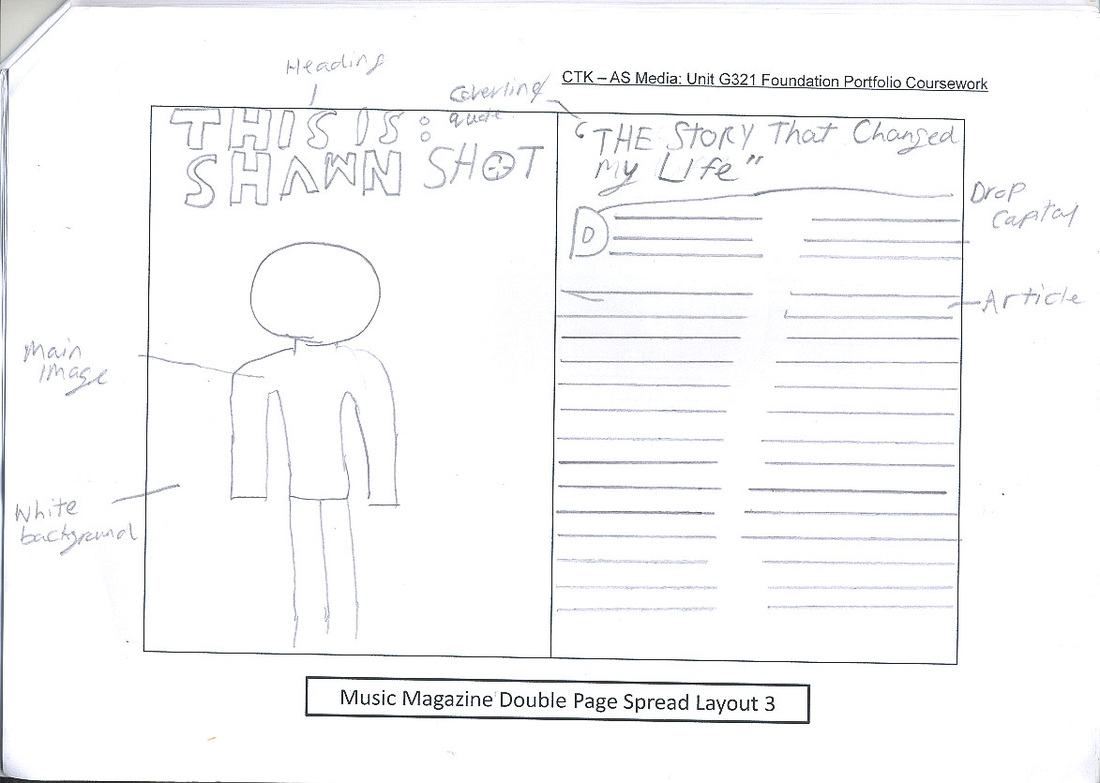
Five Double pages:
|
|
|
|
|
|
I like the pose of the main image because he is corresponding with the main subline or title. which makes the double page very unique.
|
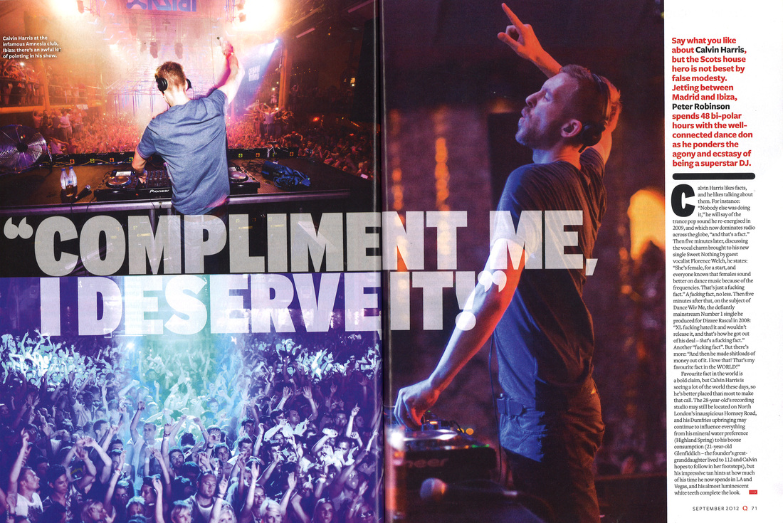
I like main image because it covers both pages and gives a nightclub feeling. The main image NVC looks very exited and it affects the reader to also share the same feelings.
|
I like the layout of this double page because it has one page full of quotes which is really unique. Also the Main image NVC is very corresponding to the quotes on the first page.
|
I like the color scheme for this double page because the colors scheme works well with the Huge drop capital on the next page because the "J" covers the whole page and shares with the color scheme with the page.
|
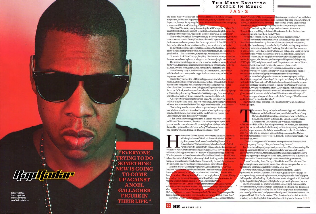
I like this double page because it is very unique is covers half the page with a famous artist name. I really like about this double page is the color scheme this is because the red color stands out from the white and black so it would be easier for the reader to know who there are reading about.
|
Genre Specific Poses & Costume
Genre Specific Costume:

|
|

|
|
|
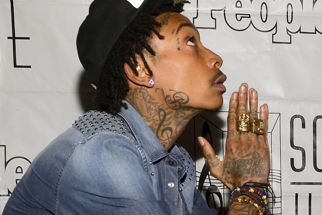
In this image of wiz Khalifa he is wearing a snap back while what looks to be he is smoking. The Snap back he is wearing, is projecting to his audiences that wearing a snap back is "cool" and is telling his audience that they should wear it to because it is the style.
|
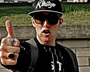
In this image of Mac Miller he is wearing all black including his snapback. The Snapback he is wearing represents sends a messages to his audiences saying that wearing a snapback is "The Style". This would encourage his young audience to wear a snapback.
|
In this image of Trey Songs, it is seen that he is wearing a snapback. Usually snapbacks are associated with rap music because may rappers wear them to show their audience that it is "cool" to wear a snapback.
|
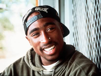
In this image of Tupac, he is wearing a snapback backwards. I believe he is wearing his snapback backwards to tell his audience that he is original and he likes to be different from other rappers because usually rappers wear there snapbacks properly.
|

|
|
|

|
|
Here we have Pharrell riding his bike and what looks to be him trying to do tricks on it. Pharrell is also wearing a blue snapback while riding a bike this indicates to his audiences that you can wear a snapback anywhere. this would encourage his audience to wear a snapback because they would want to try and imitate Pharrell.
|
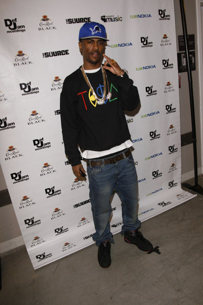
Big Sean in this image is wearing a snapback. through the setting we can sell that this may be a premier of an event. Big Sean is wearing a blue snapback this tells his audiences that snapbacks are in the fashion trend and he encourages his audiences to wear them as well.
|
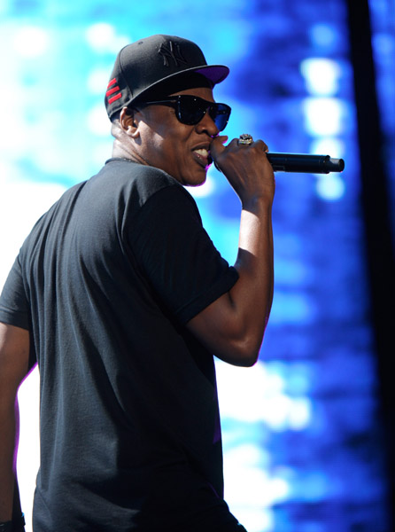
Jay Z in this image looks like he is performing. the costume he is wearing is that he is wearing a snapback. This indicates that he is telling his audiences that they should wear snapbacks because they are in the trend and he would hope to have other people wear snapbacks just like he is.
|
here we have Wale wearing a snapback posing for the picture. In this image his clothing is very smart because he is wearing a tie. Wale is encouraging others to wear a snapback because he is saying that the snapback would go with anything you wear even if you are trying to dress smart like he is in the image.
|
Genre Specific Poses:
|
|
|

|
|
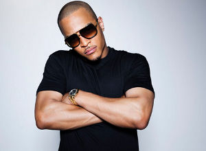
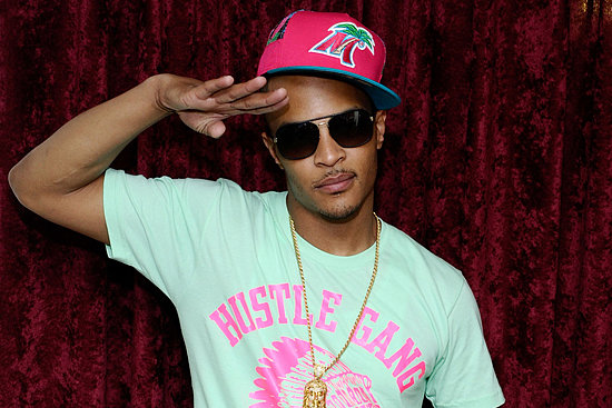
In this image of T.I he is seen folding his arms to make himself stand out. T.I NVC indicates that he has a hierarchy and he has more status. This also encourages his young audiences to act like him because he thinks that folding his arms is cool.
|
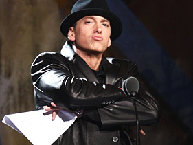
This image of Eminem we see him crossing his arms with a funny facial expression. His NVC suggests that whats he is doing (crossing his arms) is cool and he would encourage others for example his fans to act like him.
|
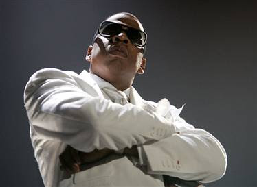
Here we have Jay-Z folding his arms with a serious expression on his face. This indicates that he is serious and he is folding his arms to have a higher status in that image. He is also encouraging others to also imitate him by folding their arms.
|
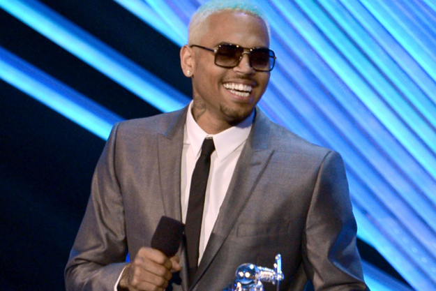
Here we have Chris Brown folding his arms posing for the image. This suggest that he thinks that crossing his arms makes him look "Cool" and so he would encourage his audience to also fold their arms when they are going to pose for a picture just like he is.
|
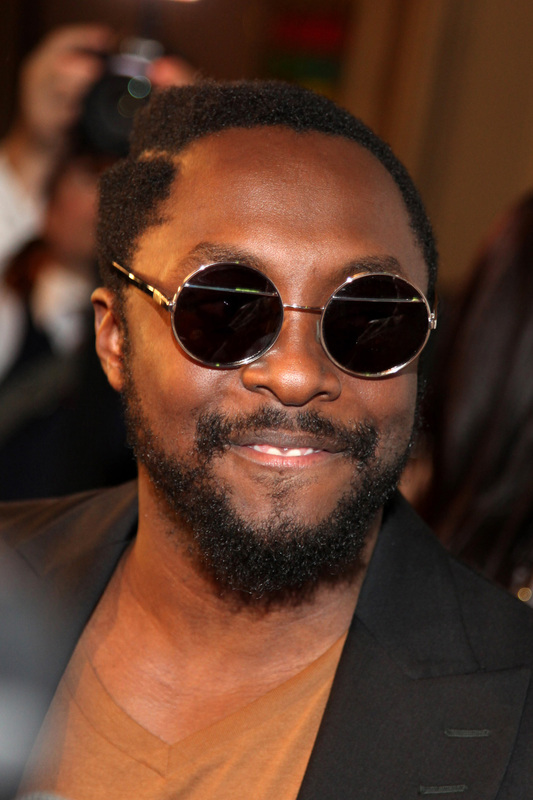
The Use Of Sunglasses:
|
|
|
In the majority of the pictures of artists from the hip hop & rap genre they are usually wearing sunglasses. The wearing of the sunglasses may connote how they want to hide their identity or they may not want to show eye contact with cameras or other people. They can also be seen as a way of showing their wealth, connoting that they can afford designer sunglasses and have money to spend on materialistic things which is important in the Hip hop genre.
The Showing of Tattoos:
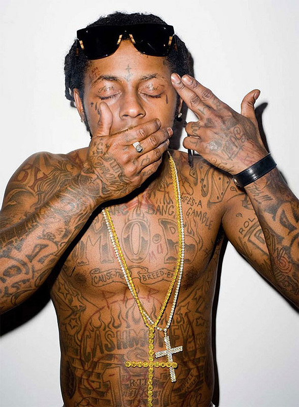
|

|
|
The showing of tattoos in the mostly rap genre is very common, most male artists have at lease have one tattoo. The examples show above have multiple tattoos, this is because tattoos may connotes there rebellious side or their trouble maker side by having tattoos such as a cross. The tattoos may have a certain meaning that maybe the artist only knows.
The use of Props (Smoking):
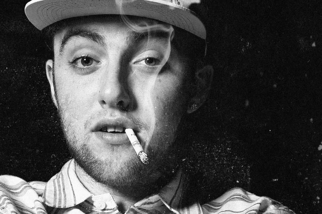
|
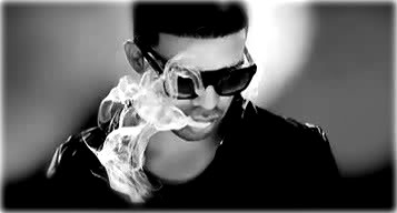
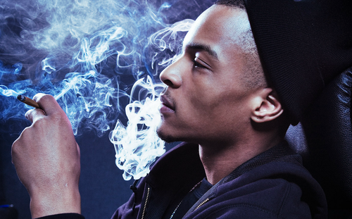
|

|
In the hip hop & rap genre a common prop that is used is a cigarette. The use of smoking connotes the idea of being "Cool" and it gives you a higher status because you are doing something that other people don't usually do. There is also connotations of danger because everyone knows that smoking kills people slowly yet these artist are promoting smoking.
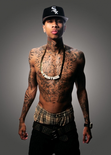
The Wearing Of Jewelry:

|

|
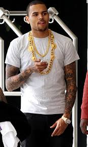
|

|
In usually the rap genre there is a common costume that is always being worn, which is a chain. Artist wear chains to all events including concerts, red carpet or just wearing it casually. By wearing a chain it connotes the sense of wealth and showing others that they don't spending lots of money on jewelry.
Facial Expressions:
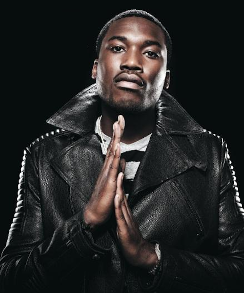
|

|
|
The facial expression of hip-hop artists are usually shown to be that of a tern nature and are quite serious. This is displayed in the images above as the rappers are all posing with a lack of smiling which connotes intimidation through their NVC because it is making the picture look quite serious and awkward.
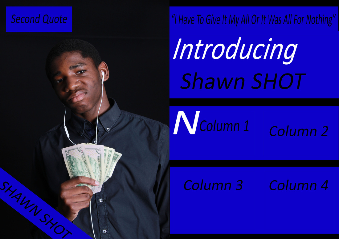
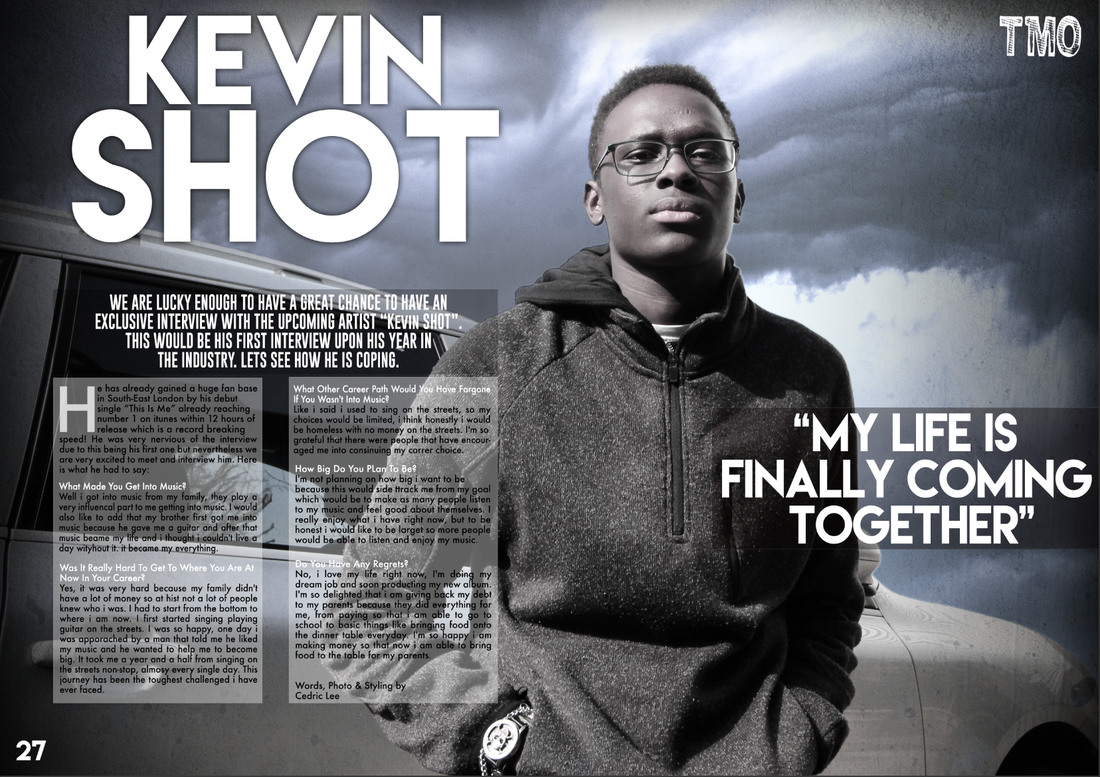
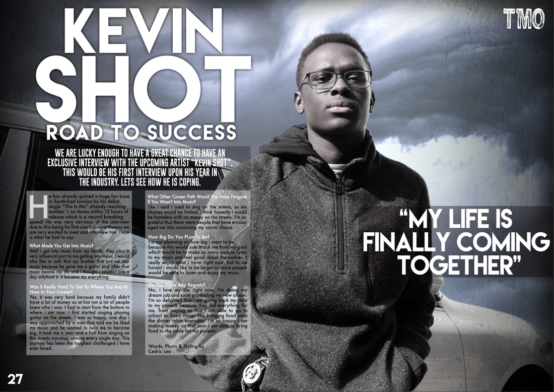
My Interview:
Introducing Shawn Shot
Interviewed by Cedric Lee

My Music Magazine Drafts: Drawn
4 Front Cover:
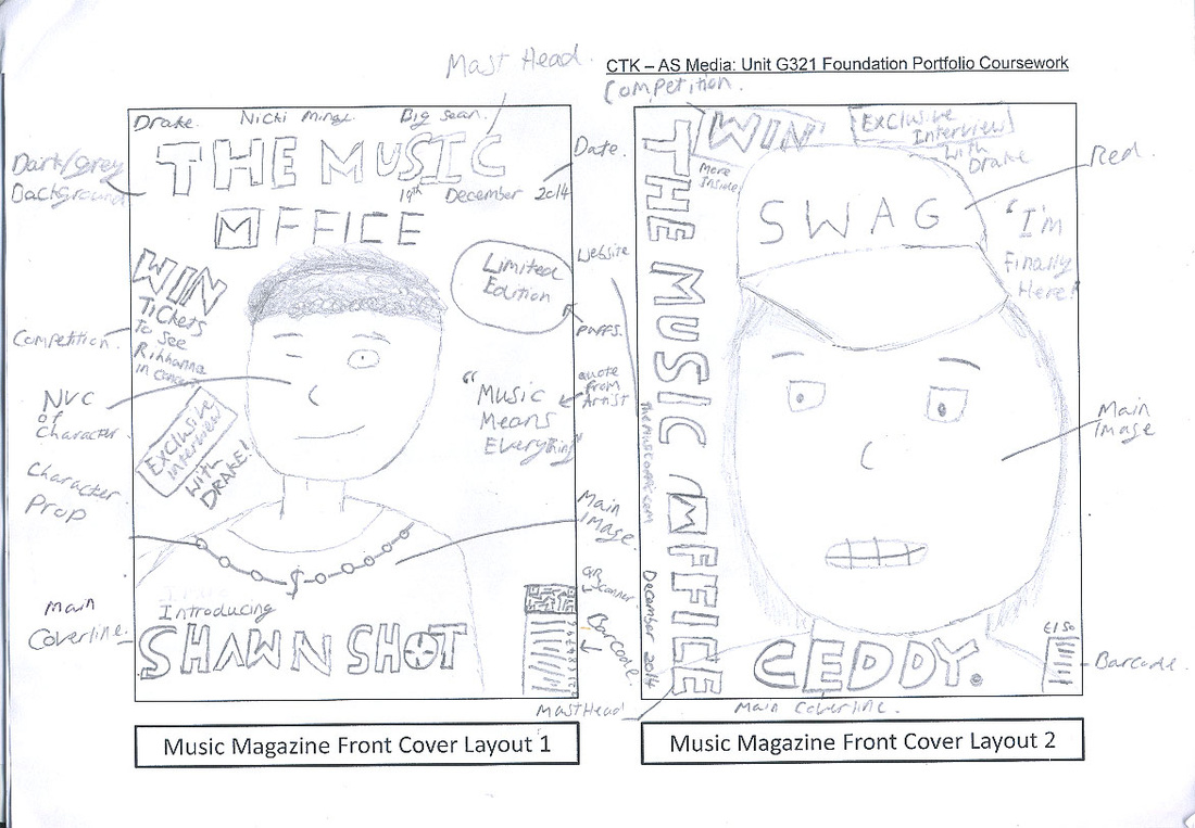
|
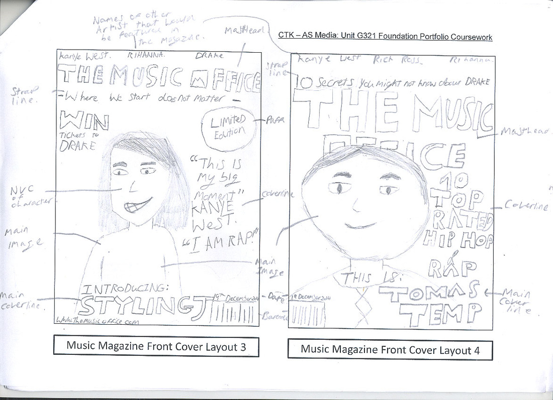
|
4 Content Page:
|
|
4 Double Page:
|

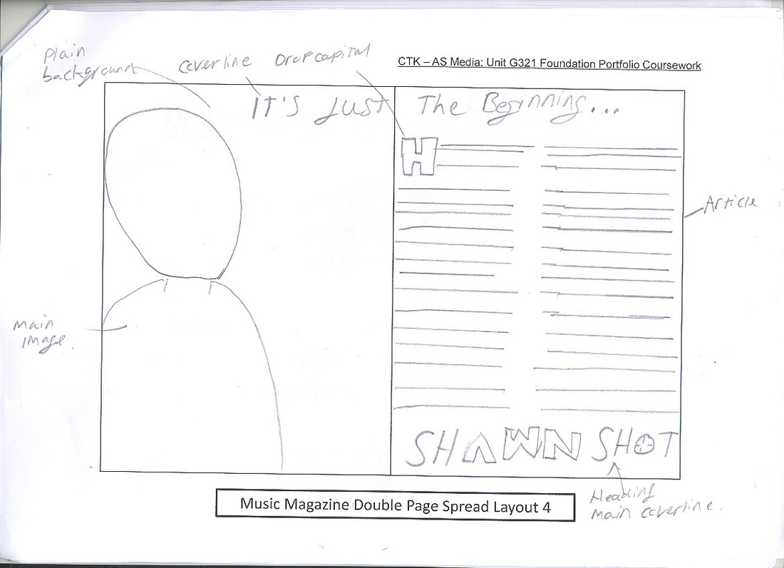
|
My Digital (Photoshop) Magazine Drafts
2 Front Cover

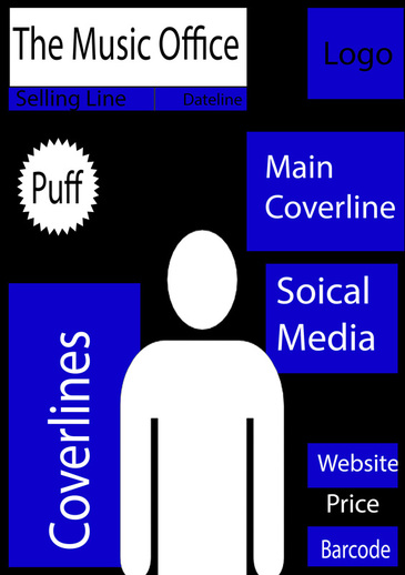
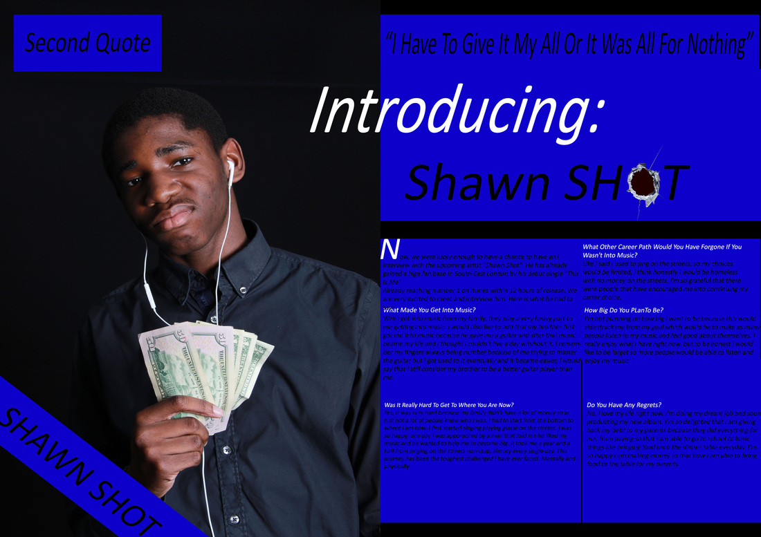
For the front cover of this digital magazine of my front cover, i was thinking i should put my masthead on the top of the magazine so that's how my masthead is on the top of the magazine. Also I wanted to surround the main image with text for example cover lines. I also added a puff because i decided it had the space to feature one and also it would make my magazine more engaging. There would also be social media near at the top so the reader would know where to find us (Facebook, twitter, etc.)

Here i decided to alter a little bit so it doesn't look the same as my first one but it still has almost the same features. For this digital front cover i decided to have the masthead a little smaller this is because i wanted to see what it would look like, i do prefer it being like my first digital draft but i still like how neat the whole magazine layout is. Also under my masthead there would be a selling line, i decided to add this because it is crucial for a magazine to have one.
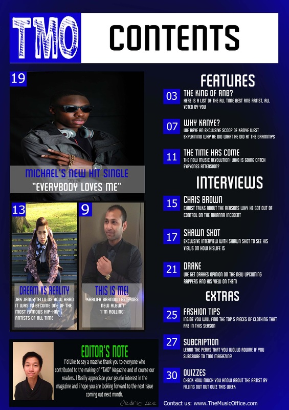
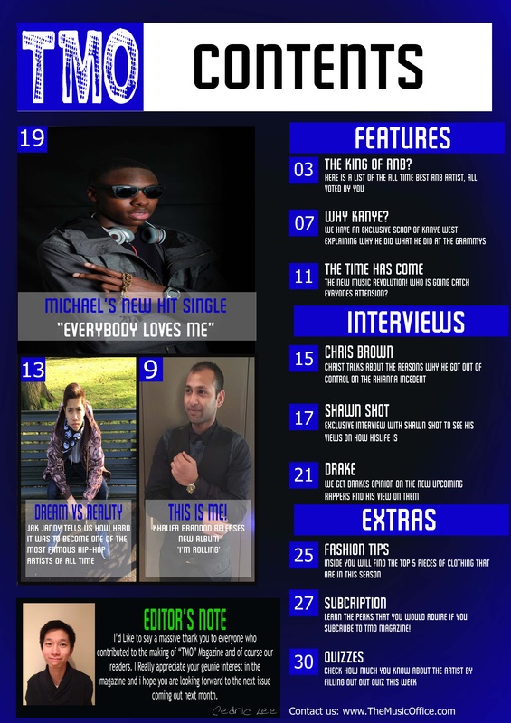
2 Content Page

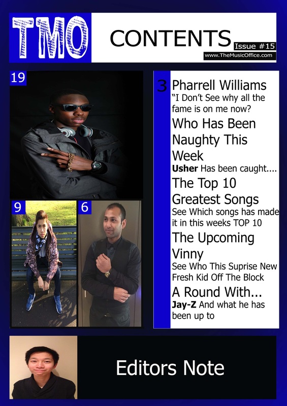
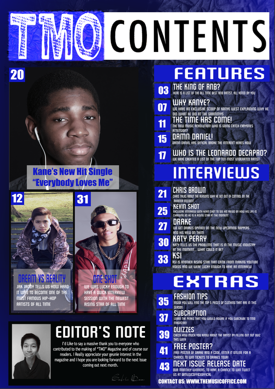
For this contents page i decided to only have one image and that image stand out. i decided to have an advertisement in my magazine, the advertisement would be music related for example a new music game is going to come. the topics & categories is next to my main image this would make it easier for the reader to read the content page because i believe that this contents page is well structured.
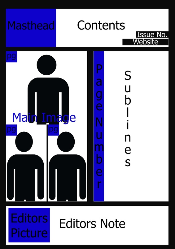
In this digital contents page draft i decided to have two images, i chose this because i wanted my contents page to be more engaging to the reader. i also have added most of the features i added in my first drawn draft, so i really like this one because it has managed to have two featured images.
2 Double Page

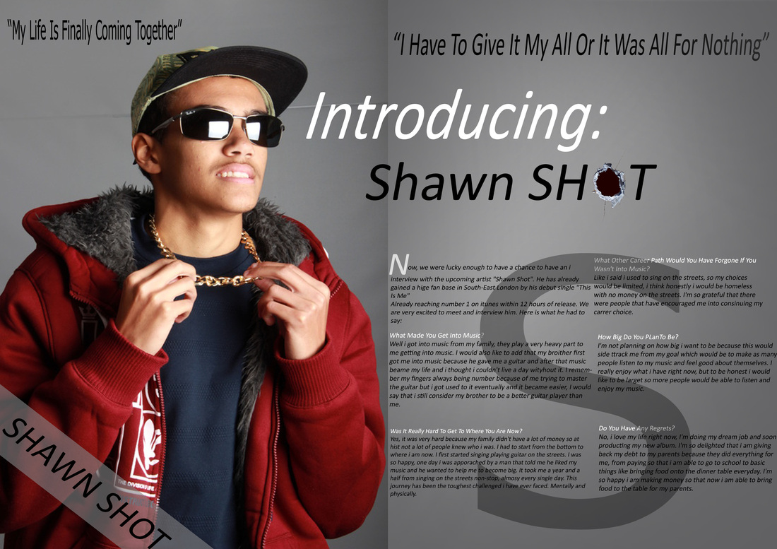
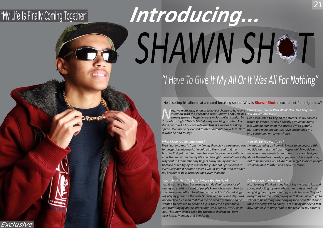
For this double page spread this allows the main image to have a whole page also on the other side of the page there is the interview. I also have added a main quote from the artist near the main image so it looks like he is saying it the quote. this double page allows me to add "other images" so i will be able to add other things like my logo or page number also i can add other picture to keep the readers full attention to staying on the interview page.

I really like this digital double page because other than the last digital draft it has 2 quotes from the artists, also the headline goes into the main image page which i personally like. Also this has the same columns so it would have the same text capacity for the interview as the first digital draft.
My Photos:
Front Page: Picture I like the most:

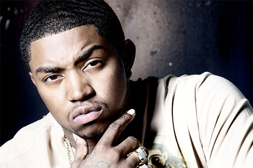
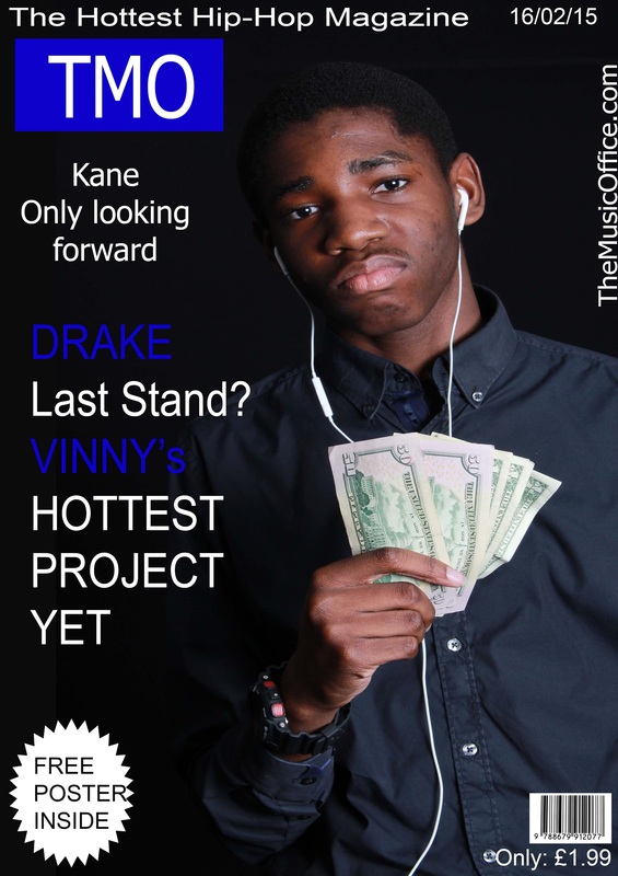
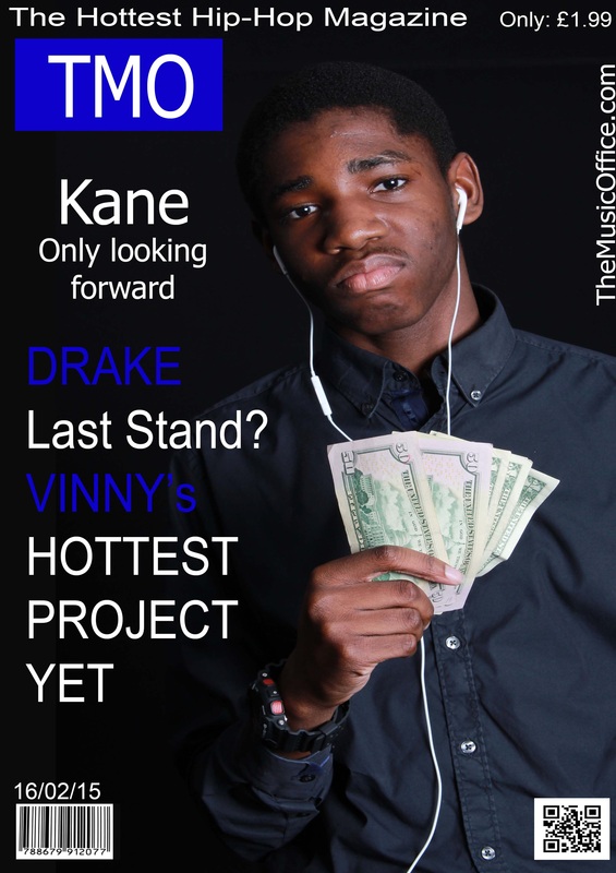
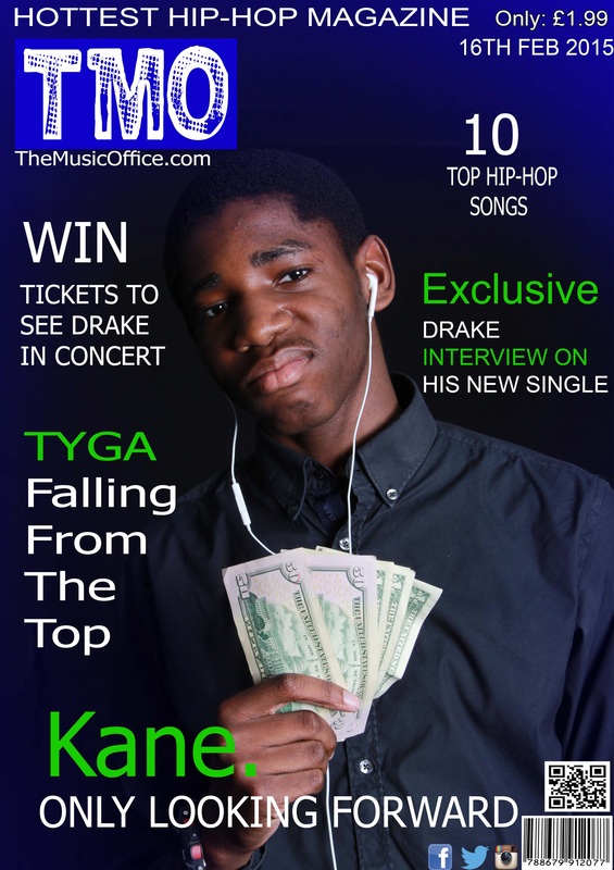
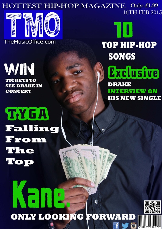
I like this picture for my front page because i feel that this image captures how hip-hop/rap artist behave. In the image shown we see the main image looking into his phone. Almost all artist is connected to social media so this image suggest that he is updating his social media. I like this image for my front page also because the costume and props he is wearing looks very expensive so this could indicate to the audiences that he is rich.
10 Front Page Images:
Content Page: Pictures I Liked the most:

|
|
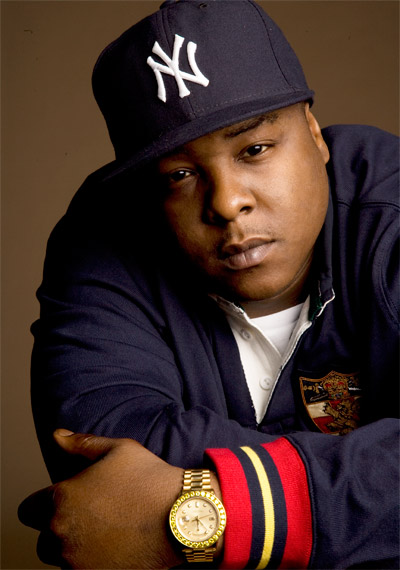
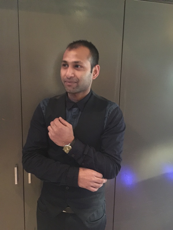
I like these two images for my contents page because the costume that they are both wearing are black/dark clothing so they would blend in together nicely. Also I love the NVC and pose on the left image, this image was taken in the studio so there is really good lighting, the only problem i have with this image is the dark background blending in with his clothing and hair colour. On the right image i like the use of prop and costume used, he is wearing and expensive clothing and wearing an expensive watch.
10 Content Page Images:
Double Page: Picture i liked the most:
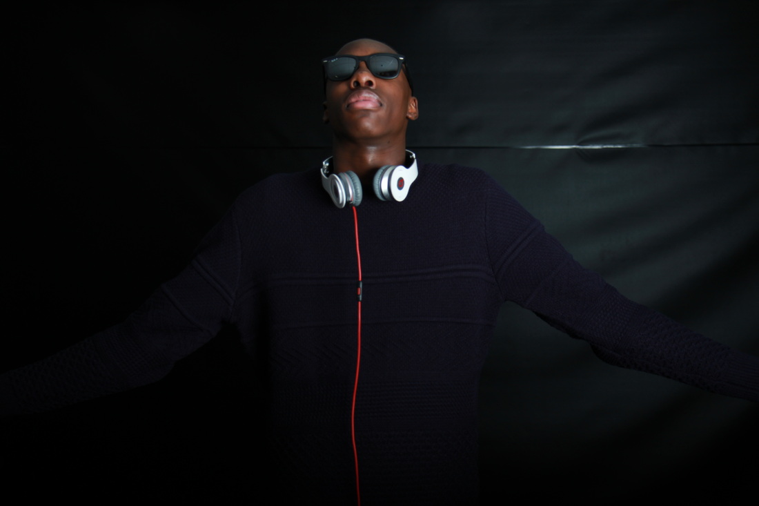
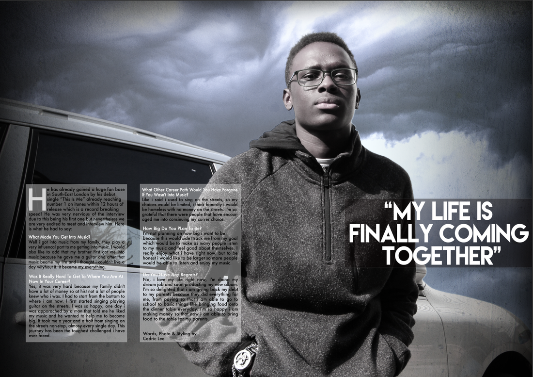
I like this image the most because it is the one that stands out the most, also by the NVC it tells a lot about his character. i also like the props used: his sun glasses and his headphones. The only problem that i see is that he is wearing really dark clothing so it would be hard to get this image onto my double sided page. The only way i can see this happening is if my background is going to be black, so i work around this issue.
10 Double Page Images:
Other Images:
Magazine Stages
Front Page
|
|
|
|
|
|

|

|

|
Content Page
|
|
|
|
|
|

|
|
|
Double page
|
|
|
|
|
|
|
|
Final Product:
Front Cover: |
Contents Page: |

|

|
Double Page Spread:

